Product page guide
Everything a shopper needs to choose and buy, in one place. Here's how to set up each part.
The product page is built from the Product information section plus optional sections around it. Inside Product information you can reorder these blocks: Title, Price, Description, Buy buttons, Trust strip, Line item text, Line item dropdown, Text, Custom Liquid and app blocks. See the Sections and blocks reference for every setting.
Variants and swatches
When a product has options such as size or color, Plinth shows one group of buttons per option, with the chosen value next to the option name.
- Text buttons are used for most options, like sizes.
- Color or pattern swatches appear automatically when an option value has swatch data in Shopify. When you add an option such as Color to a product, Shopify suggests linking it to a category metafield. Linked values get a swatch color or image, which you can edit in Content > Metaobjects. Swatch names are still announced to screen readers.
- Sold-out combinations are shown crossed out, but shoppers can still select them to see the details. The button then reads Sold out or Unavailable.
- Choosing a variant updates the price, the add-to-cart button, the main image, the sticky add-to-cart bar, pickup availability and the page address. That means a shared link opens the same variant.
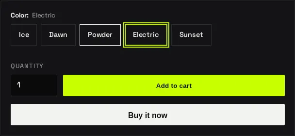
Variant images: assign an image to each variant in the product’s Variants list. When a shopper picks that variant, the gallery jumps to its image.
Custom options (line item properties)
Collect extra details with an order, such as engraving text or a gift-wrap choice. These are added as blocks in the Product information section:
- Line item text: a text box with a label, optional placeholder and maximum length (0 means no limit). Turn on Required if the shopper must fill it in before adding to cart.
- Line item dropdown: a list of choices. Enter them as a comma-separated list, for example
None, Gift wrap, Gift wrap and card.
The label becomes the field name on the order, so you’ll see “Engraving: Alex” in the cart, at checkout and in your admin order. A field left blank isn’t shown.
Tip: Custom options appear for every product that uses the template. Create a separate product template for products that need them. The included flagship template is an example.
Gift cards
Plinth supports Shopify gift cards, including sending a gift card straight to someone else.
- Create a gift card product in Products > Gift cards > Add gift card product, with the amounts you want to offer.
- In the theme editor, open Theme settings > Cart and keep Show recipient information form for gift card products turned on (it is by default).
On the gift card’s product page, shoppers can check I want to send this as a gift and enter:
- the recipient’s email (required when sending as a gift),
- the recipient’s name (optional),
- a message of up to 200 characters (optional), and
- a send on date up to 90 days ahead (optional; leave blank to send right away).
If something is wrong, like an invalid email, the error appears next to the field. The form also works when JavaScript is turned off.
Good to know: Shopify's dynamic checkout buttons (like Buy it now and Shop Pay) don't support gift card recipient details, so Plinth hides them on gift card products while the recipient form is on. Shoppers add the gift card to the cart and check out from there.
The gift card page (the page recipients open from their email) shows the balance, the code with a copy button, a QR code for in-store use, an Add to Apple Wallet link, a print button, the scheduled send date and the sender’s message.
Subscriptions (selling plans)
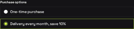
If you sell subscriptions or other purchase options, Plinth shows a Purchase options group on the product page with One-time purchase (when allowed) and each plan.
- Install a subscriptions app, such as Shopify Subscriptions, and create a plan, for example “Delivery every month, save 10%”.
- Add your products to the plan in the app.
The price updates when a shopper picks a plan, and the plan name appears on the cart line. If a product can only be bought on subscription, the first plan is selected for them.
Store pickup
When local pickup is available, the product page shows “Pickup available at…” with the usual pickup time and a link to check other stores. The link opens a panel listing each location’s availability, address and phone number.
To turn it on, go to Settings > Shipping and delivery > Local pickup, and enable pickup for each location that offers it. Pickup only shows for variants that are stocked at a pickup location, and it updates when the shopper changes variant.
Media: images, video and 3D
The gallery shows every media item on the product, in the order you set in the product’s Media area:
- Images, with thumbnails you can browse with the arrow keys.
- Videos: uploaded videos, or YouTube and Vimeo links. Videos load only when the shopper presses play, which keeps the page fast.
- 3D models, with a View in your space button for augmented reality on supported phones.
Add alt text to every image and a short description to every video (select the media, then Add alt text). Screen readers use it, and it helps search engines.
Recommendations and complementary products
Add the Product recommendations section to a product template and choose its Type:
- Related products are picked automatically by Shopify, based on what’s often bought together and on product similarity. They improve as your store gets more orders.
- Complementary products are picked by you. Install the free Shopify Search & Discovery app, open Product recommendations, choose a product and add its complementary products.
Both default product templates already include one of each. The section loads after the rest of the page and stays hidden when there’s nothing to show, so it’s safe to leave in place.
For a hand-picked set of extras on every product, use the Add-ons grid section with your add-ons collection.
Other product page features
- Sticky add-to-cart bar: appears when the main button scrolls off screen. Turn it off with Show sticky add-to-cart bar in Product information.
- Trust strip: up to four short reassurance points with icons. They’re blank by default, so enter only policies you actually offer. Blank points are hidden.
- Shop Pay Installments: a message under the price when your store is eligible and installments are turned on in your Shop Pay settings.
- Unit prices: shown under the price when you set unit pricing on a variant, where Shopify supports it for your store’s region.
- Tax and shipping note: shows “Taxes included” when your prices include tax, and a link to your shipping policy when you’ve added one.