Plinth documentation
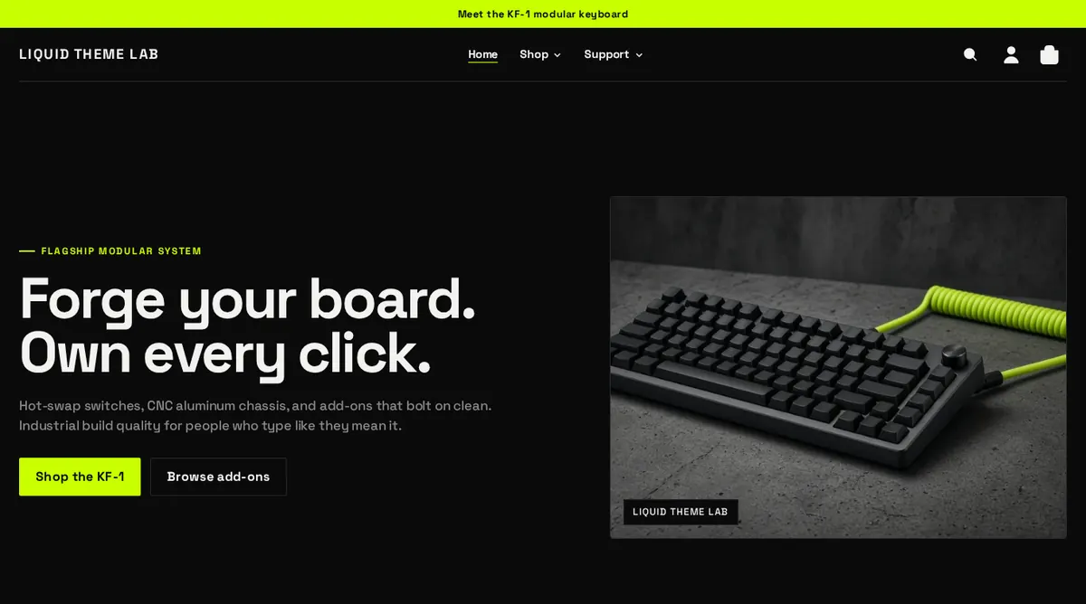
Plinth is a bold, high-contrast Shopify theme built to put one hero product front and center, with add-ons, subscriptions and gift cards around it.
Get started Get supportThese guides are written for store owners. You don’t need to know any code. Every setting and section in the reference pages comes straight from Plinth 1.1.8, so the names match what you see in the theme editor.
Guides
- Getting startedInstall Plinth, set up your flagship product, menus, logo and brand name.
- Theme settingsEvery option in Theme settings, explained group by group.
- Sections and blocksWhat each section does, its settings and tips for using it well.
- Product pageVariants, swatches, custom options, gift cards, subscriptions, pickup and recommendations.
- CartThe cart drawer, suggestions, order notes and discounts.
- Filtering and searchCollection filters, sorting and search suggestions.
- LocalizationCountries, currencies, languages and translations.
- Accessibility and performanceWhat Plinth does for you, and what to check yourself.
- FAQ and troubleshootingQuick fixes for the most common questions.
What’s included
- A flagship-first home page: hero, featured product band, feature grid, add-ons grid, comparison table and guarantee band. Every section can be reordered, hidden or removed.
- A rich product page: a media gallery with video and 3D, color swatches, custom text and dropdown options, subscriptions, gift card recipient details, store pickup, a sticky add-to-cart bar and related or complementary products.
- A slide-out cart drawer with add-on suggestions, discounts and an optional order note.
- Collection filters and search suggestions powered by Shopify Search & Discovery.
- Country, currency and language selectors for selling internationally.
- Built for accessibility and speed: keyboard and screen reader support throughout, and no heavy scripts.
Need help?
Check the FAQ and troubleshooting page first. If you’re still stuck, contact support.